.png)
In ecommerce, people do not touch your product. They judge it by what they can see in two seconds on a phone screen. That is why ingredient visuals, texture close-ups, and results-style images can outperform almost any generic angle shot.
They do the hard job: make the product feel real, understandable, and worth the price.
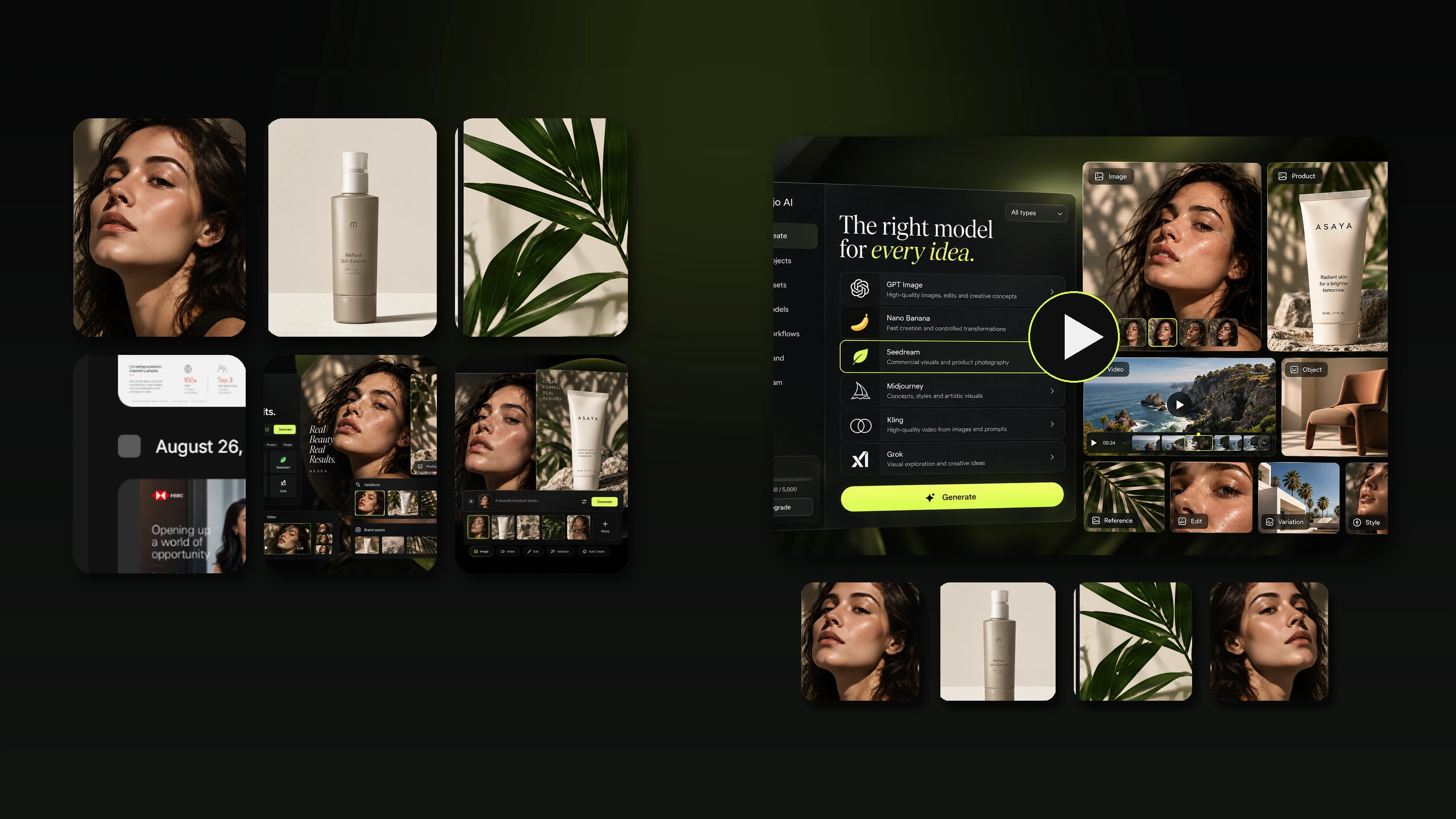
This guide explains how to show ingredients, texture, and key results in product images without turning your listing into a messy infographic. You will learn which frames work best, where to place them in your gallery, how to keep them believable, and how to scale these visuals across variants and product lines using Mujo AI.
.png)
Why Ingredients, Texture, and Results Matter So Much
These three visual themes answer the biggest buyer questions.
- Ingredients answer: what is this made of, and can I trust it?
- Texture answers: what will it feel like, how does it apply, what is the finish?
- Results answer: what changes after I use it, and how quickly?
They also reduce friction in competitive categories like beauty, skincare, supplements, hair care, pet care, and even food and beverages. When shoppers compare similar products, the winner is often the listing that communicates substance and outcomes fastest.

The Most Important Rule: Be Clear, Not Loud
A common mistake is turning ingredient and results visuals into a wall of labels, icons, and claims. That kills trust.
A strong ecommerce visual is:
- one message per image
- one focal point
- readable on mobile
- consistent with the brand style
When you design ingredient callouts or results frames, treat them like product photography, not advertising banners.
Section 1. Ingredient Visuals That Build Trust
Ingredient imagery works best when it feels specific and grounded.
1. Ingredient callout image
What it is: the product with one to three highlighted ingredients around it.
Best for: skincare, hair care, cosmetics, food, supplements, and pet products.
What to show: ingredient visuals that match the promise, not random pretty fruits or generic botanicals.
How to keep it believable: only highlight ingredients that are truly relevant to the buyer’s decision.
.png)
2. Ingredient hero frame
What it is: one ingredient as the main subject with the product secondary.
Best for: when a single ingredient is your main differentiator.
What to show: ingredient texture or raw-material mood without clutter.
Use carefully: do not overdo natural-looking visuals if your brand is clinical or minimalist.
3. Label and ingredient proof close-up
What it is: a clear close-up of the label where key ingredient language is readable.
Why it matters: many shoppers want proof from the packaging, not just marketing copy.
How to shoot or design it: sharp, well-lit, no glare, no distortion.

Ingredient images that backfire
- too many ingredients shown at once
- ingredients that do not match the formula or category
- visuals that look like stock clichés
- tiny text and overcrowded badges
Section 2. Texture Images That Make the Product Feel Real
Texture is where ecommerce becomes sensory. If shoppers can feel it with their eyes, conversion rises.
Texture visuals work especially well for:
- creams, gels, serums, and masks
- makeup such as foundation, gloss, and balm
- hair products like wax, mousse, and oil
- food items such as sauces, spreads, and powders
- fabrics and materials for apparel, bedding, and accessories
1. Macro texture close-up
What it is: an extreme close-up of the product surface or material.
Goal: show smoothness, thickness, grain, shimmer, or absorption feel.
Rule: keep it clean. One texture per image.

2. Smear or swipe shot
What it is: a controlled smear of product on a neutral surface.
Why it works: it communicates viscosity and finish fast.
Best practice: keep the smear shape intentional and premium-looking.
3. On-skin texture and finish
What it is: a close-up of application on skin or hair.
What it communicates: finish, glow, matte effect, coverage, and absorption.
Important: keep lighting honest. Overly retouched skin destroys trust.

Texture mistakes that cost sales
- glossy glare that hides the real finish
- heavy filters that change color
- texture shots that are beautiful but unclear
- too much zoom without context, so shoppers cannot tell what they are seeing
Section 3. Results Images That Sell Without Looking Fake
Results visuals are powerful and risky at the same time. Done well, they reduce uncertainty. Done poorly, they look like manipulation.
Results images work in three main formats.
1. Before and after frame
Best for: skincare routines, hair results, cleaning products, and home improvement.
What to show: consistent framing, consistent light, and the same angle.
How to keep it trustworthy: avoid dramatic edits and unrealistic jumps.

2. Key results highlight frame
Best for: when you have two or three outcomes that matter most.
What it is: the product plus two or three short results statements supported by a simple visual cue.
Rule: make the result readable, but do not overload the frame with claims.
3. Problem and solution visual
Best for: pain-point products like blemish control, frizz control, or stain removal.
What it shows: the problem state and the solved state in a clean way.
Tip: keep the visuals concrete, not abstract.

Where to Place Ingredients, Texture, and Results in Your Gallery
A strong gallery works like a funnel. These frames belong in specific positions.
Recommended eight-image order for ingredient- and texture-driven products:
- Main hero image
- Primary benefit or results promise
- Ingredients callout for trust
- Texture close-up for sensory proof
- In-use or on-skin finish for realism
- Label proof close-up for credibility
- Before and after or comparison for decision help
- What’s included or routine steps for clarity

A Simple Table: Frame → What to Show → What It Solves
| Frame type | What to show | What it solves for the shopper |
|---|---|---|
| Ingredients callout | product + 1–3 ingredients | builds trust, explains why it works |
| Ingredient hero | one ingredient as main | highlights a differentiator fast |
| Label close-up | readable key label area | proof and credibility |
| Macro texture | one clear texture surface | shows thickness, finish, quality |
| Smear or swipe | controlled smear on neutral | shows viscosity and feel quickly |
| On-skin finish | small realistic area | shows real-world look and effect |
| Before and after | consistent panels | reduces uncertainty, supports decision |
| Key results frame | 2–3 outcomes + product | clarifies value in seconds |
How to Keep These Visuals Mobile-Friendly
Mobile is where most ecommerce decisions start. If your ingredient frame only works on desktop, it is not doing its job.
Mobile-friendly rules:
- keep text large and short
- use one to three callouts, not eight
- keep contrast clean
- one focal point per image
- avoid tiny icons and dense badges
- do not hide critical info in a corner
A quick test: if you zoom out until the image is the size of a phone screen and the message disappears, simplify.
Category Notes: What Matters Most by Niche
Beauty and skincare
Texture and finish matter more than almost anything. Use macro and on-skin frames early in the gallery.
Supplements
Trust and label proof matter most. Use label close-up and ingredient logic, but avoid overly fantasy-style ingredient imagery.
Food and beverage
Texture and serving context matter. Show ingredient authenticity and real serving shots.
Hair care
Before and after plus finish in hair matter. Keep lighting consistent or it will look fake.
Apparel and materials
Texture is fabric. Show weave, thickness feel, and real-life drape.
How Mujo AI Helps You Scale Ingredient, Texture, and Results Visuals
Creating these frames manually for every SKU is slow. You need consistency across variants, and you need speed when a brand launches new products.
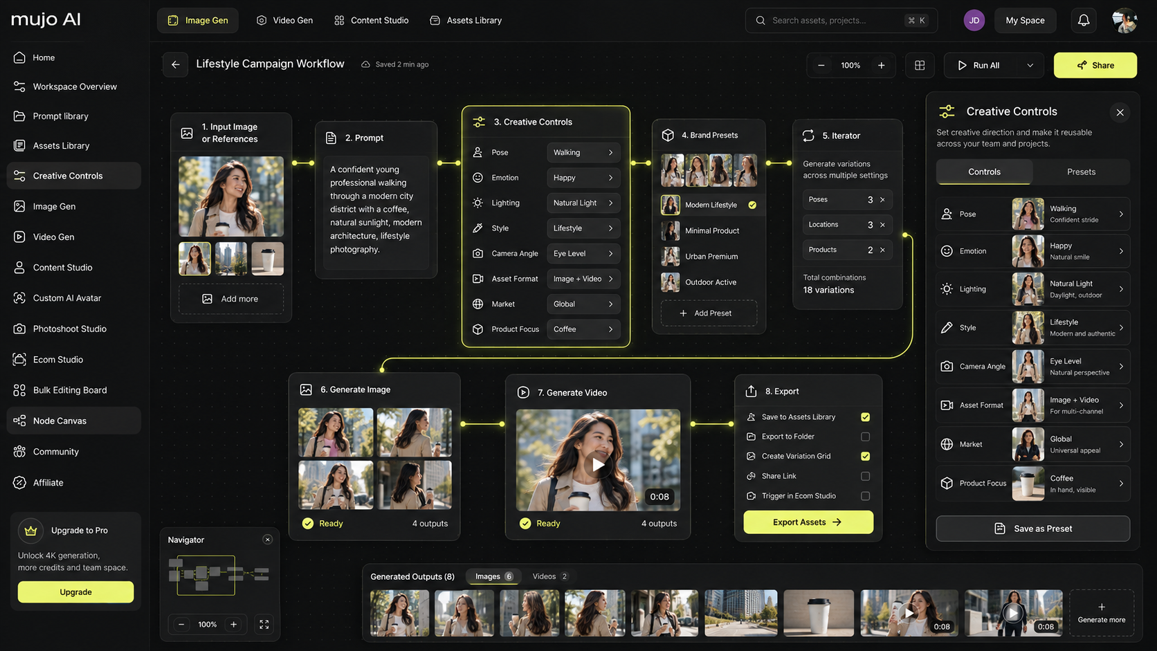
Mujo AI helps you work like a virtual studio:
- generate ingredient callouts that match the brand style
- create clean texture close-ups and smear-style visuals
- build results frames like before-and-after, key outcomes, and problem-solution images
- keep visual consistency across variants and packs
- export a full gallery set ready for ecommerce and marketplaces
A practical workflow
- Start with one clean product photo
- Generate an ingredient callout frame with one to three key ingredients
- Generate macro texture and smear frames in the same style
- Create a key results frame with two to three outcomes
- Add a label close-up and a clean in-use finish image
- Export as an ordered gallery that tells a story

Common Mistakes and How to Fix Them Fast
Problem: ingredient image looks like stock and feels fake
Fix: reduce it to one or two ingredients, match the product’s tone, and add a label proof close-up.
Problem: texture image is pretty but unclear
Fix: simplify the lighting, zoom slightly out, and show one clean texture surface.
Problem: before and after looks manipulated
Fix: use consistent framing, consistent light, and realistic differences. Add a small note such as “results may vary” if compliance requires it.
Problem: too much text everywhere
Fix: keep one message per image. Move extra details into bullets or A+ modules.
Mini FAQ
How many ingredients should I show in one image?
Usually one to three. More than that becomes clutter and reduces trust.
Where should texture images go in the gallery?
Early to mid gallery, right after the main benefit and ingredients, because texture is sensory proof.
Do before and after images work for every category?
No. They work best when the outcome is visually clear. When it is not, use key-results frames and label proof instead.
What is the fastest way to improve trust with product images?
Add one label close-up proof frame and one clean texture macro frame. These two often reduce skepticism immediately.