Color Psychology for Ecommerce Product Images
Color is one of the fastest yes-or-no signals on a product page. Before a shopper reads a title or checks reviews, they feel something from the image: calm, trust, energy, cleanliness, premium quality — or the opposite: cheap, risky, confusing.
This guide takes a practical, ecommerce-first approach to color psychology in product images. You will learn how to use backgrounds, accents, and brand palettes to influence attention and conversion without making photos look fake. You will also get testing ideas and a clear way to apply blue color psychology specifically, because blue is one of the most used and most misunderstood colors in ecommerce.
Why Color in Product Photos Affects Sales
Color influences three buyer behaviors that matter on product pages.
Attention
Color contrast decides what the eye lands on first. If the product blends into the background, you lose the scroll battle.
Meaning
Color carries instant associations. Blue often signals reliability. Black can signal premium quality. Green often signals naturalness. Red signals urgency or intensity. These associations shape how a shopper interprets your product without thinking.
Confidence
Consistent, true-to-life color builds trust. Inconsistent color raises risk. If a buyer doubts color accuracy, they hesitate or return the product.
The goal is not manipulation. The goal is to reduce uncertainty and guide the eye so the product is easier to understand.
The Three Color Controls You Actually Have in Ecommerce
Most brands try to pick a palette and stop there. For product images, you have three practical levers:
Background color and tone
White, off-white, light gray, dark, textured, gradient, or lifestyle environment.
Accent color elements
Borders, callout cards, comparison charts, icons, arrows, and highlight blocks.
Color temperature and grading
Warm versus cool light, white balance, contrast, saturation, and the difference between clean and moody.
You rarely need to change the product’s actual color. You need to control what surrounds it.
Color Psychology Basics for Product Images
Color psychology in ecommerce is less about “what does red mean” and more about how hue, saturation, and brightness change perception.
Hue
The color family: blue, green, red, yellow, and so on.
Saturation
How intense the color is. High saturation can look energetic or cheap, depending on the category.
Brightness
How light or dark a color appears. Dark can look premium or heavy. Bright can look clean or childish.
Temperature
Cool, meaning blue-ish, feels crisp and controlled. Warm, meaning yellow or orange, feels cozy and friendly.
A simple rule: the closer you are to medical, tech, or clean positioning, the more cool and controlled tends to work. The closer you are to food, home, or cozy positioning, the more warmth tends to work.
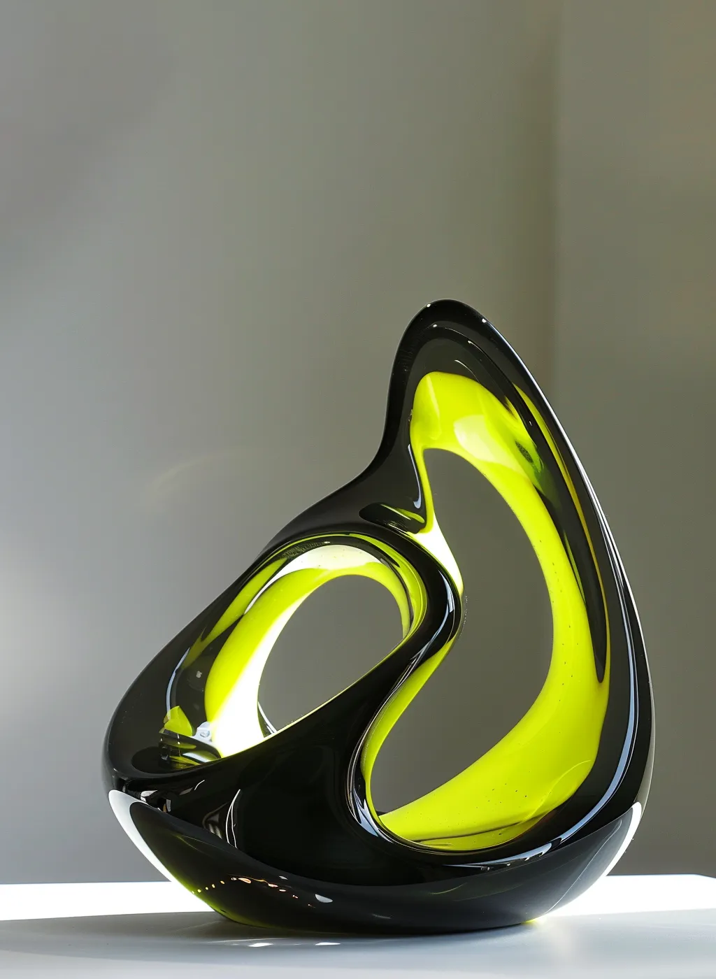
Blue Color Psychology: What It Signals in Ecommerce
Blue is popular because it often communicates:
- trust and reliability
- cleanliness and safety
- calm and control
- professionalism and system thinking
- modern, tech-forward quality
That is why blue appears so often in fintech, software, healthcare, and clean beauty. But blue is not universally positive. In some contexts, blue can feel:
- cold or distant
- sterile
- less appetizing for food
- too corporate for handmade or cozy lifestyle brands
The key is shade choice and how you combine blue with neutrals or warm accents.
Which Shades of Blue Work Best for Product Images
Not all blues convert the same way. Use shade strategy.
Light blue
Feels clean, airy, and fresh. Great for gentle and safe positioning. Risk: it can feel weak if overused.
Sky blue or bright blue
Feels energetic and modern. Great for tech accessories and sporty categories. Risk: it can look cheap if too saturated.
Teal or blue-green
Feels modern and smart and often signals wellness. Great for clean beauty and premium home goods. Risk: it can shift product color if reflected back onto the product.
Navy or deep blue
Feels premium, stable, and serious. Great for luxury, business, and built-to-last positioning. Risk: it can reduce friendliness and darken the page if overused.
A simple pairing rule:
- blue + white or off-white = clean trust
- blue + warm beige = trustworthy but human
- blue + black = premium tech
- blue + green = wellness and science-backed
- blue + yellow or orange accent = energy without chaos
Background Strategy: Marketplace vs DTC
Your background options depend on where you sell.
Marketplace-first, Amazon-style
Your main image typically needs a clean, neutral background and the product must be unmistakable. Use color psychology mostly in secondary images: benefit cards, comparison frames, and lifestyle scenes.
DTC product pages
You can use background tone and brand color more freely. But you still need clarity and true-to-life product color.
A useful approach:
- main hero: neutral background for recognition
- secondary frames: controlled brand-color accents to communicate meaning
- lifestyle frames: real environments to build desire and context
Table: Color Goal → What to Change → Where to Use It
| Goal | What to change | Where to use it | What it improves |
|---|---|---|---|
| Increase trust | Cool neutrals, soft blue accents | Benefit cards, proof frames | Confidence, lower skepticism |
| Look cleaner | Bright but gentle background tones | Hero and detail shots | Perceived quality |
| Feel more premium | Darker tones, navy accents, restrained saturation | Comparison, materials, close-ups | Price tolerance |
| Feel more cozy | Warm neutrals, soft warm lighting | Lifestyle frames | Emotional connection |
| Highlight a key feature | One contrasting accent color | Icons, callouts, arrows | Scan speed on mobile |
| Separate variants | Consistent frame + distinct accent | Variant chooser images | Reduces confusion |
Accents: How to Use Color Without Making Images Look Fake
Most ecommerce images fail because they use too many colors at once. Accents should guide the eye, not become the product.
A clean accent system:
- use one primary brand color, often a blue tone
- use one neutral base, such as white, off-white, or light gray
- use one support accent, such as warm beige, soft green, or muted gold
If you need a simple guideline, use the 60–30–10 idea:
- 60% neutral space
- 30% product and real materials
- 10% accent graphics
Accents that work well:
- thin borders and corner tags
- simple icons
- one highlight box for a key metric
- ingredient callouts with minimal text
- comparison chips like A vs B in a consistent style
Accents that usually hurt conversion:
- rainbow palettes
- too many gradients
- neon colors for premium categories
- text-heavy banners that look like ads
Category Playbook: When Blue Works Best, and When It Doesn’t
Tech and electronics
Blue works extremely well because it matches expectations: reliability, compatibility, and precision. Pair it with white or black for a clean modern look.
Health and wellness
Blue can signal cleanliness and safety. Teal often feels like modern wellness. Use soft blue with warm neutrals to avoid sterile vibes.
Beauty and skincare
Blue suggests clean formulas and science-backed positioning. It works best for minimal, clinical aesthetics. Add warm accents if your brand is more emotional or luxurious.
Home and organization
Blue can feel calm and structured. Use it as an accent rather than a full background unless the environment supports it.
Food and supplements
Blue is tricky for appetite and tasty perception. For supplements, blue can signal safety and science. For food, consider warmer tones for lifestyle and keep blue limited to brand accents.
Handmade and artisan
Blue can work if the brand is modern and minimalist. For cozy handmade positioning, warmer palettes often feel more authentic. If you use blue, choose muted or dusty blues with natural textures.
Keep Product Color True: The Number One Trust Rule
No color psychology trick is worth it if the product color becomes inaccurate.
The biggest causes of “color doesn’t match photos” complaints:
- mixed lighting, such as daylight plus warm indoor lights
- auto white balance changing from shot to shot
- heavy filters and strong color grading
- blue backgrounds reflecting onto light-colored products
- shooting near colored walls that cast a tint
Practical fix:
- keep lighting consistent
- lock white balance when possible
- use neutrals around the product
- check color on more than one device before publishing
Above-the-Fold Color Design: Hero Images and the First Screen
For product pages and landing pages, color on the first screen should do three things:
- make the product pop
- reinforce brand trust
- keep the page readable on mobile
A strong hero section color system:
- neutral base behind the product for clarity
- blue accent used in small UI areas such as badges, icons, and borders
- a warm human neutral for balance, such as beige, sand, or light wood
- one consistent highlight color for key info, used sparingly
If your hero background is blue, it must be very controlled:
- low saturation
- plenty of negative space
- product contrast still high
- no tint cast on the product
A/B Test Ideas: How to Test Color Changes in Ecommerce
Color decisions should be tested, not debated. But testing must be structured, or you will change too many variables at once.
High-leverage tests for product images:
- background tone: pure white vs warm off-white
- accent color: blue vs neutral gray for benefit icons
- saturation: vivid blue vs muted blue for frames
- trust strip style: blue badge vs minimal text badge
- hero environment: cool clean vs warm cozy lifestyle
- variant differentiation: color-coded accents vs labels-only
Important testing rule: change one variable and keep everything else the same. Otherwise you will not know what caused the lift.
| Test idea | Hypothesis | What to measure |
|---|---|---|
| Blue accents on benefit cards | More trust and clarity | Conversion rate, add-to-cart |
| Muted vs bright blue | Premium feel increases price tolerance | Conversion rate, refund rate |
| White vs off-white background | Off-white feels warmer and boosts comfort | Time on page, conversion |
| Cool vs warm lifestyle | Warm scenes increase desire for home categories | Scroll depth, conversion |
| Blue trust strip near CTA | Trust improves decision speed | CTA clicks, checkout starts |
| Variant frames with blue chips | Faster variant selection | Variant selection rate, conversion |
Accessibility and Global Audiences
Color perception is not identical for everyone. If a page relies only on color to communicate information, you will lose shoppers.
Practical accessibility rules for image design:
- do not use color alone to indicate best option or warning
- use shape, icons, and labels alongside color
- keep strong contrast between text and background
- avoid tiny colored text on colored backgrounds
- if you use blue as a link cue in graphics, make it obviously clickable or label it clearly
Global nuance:
Color associations differ by culture, but ecommerce patterns remain consistent: clarity and consistency usually beat symbolism. Blue tends to be broadly safe for trust positioning, but the shade and context decide whether it feels premium, clinical, or cold.
Checklist: Color Psychology for Ecommerce Images
Strategy
- I know the primary emotion: clean, premium, cozy, energetic, or clinical
- I picked one dominant neutral background approach
- I chose one main accent, often blue, and one support accent
Execution
- product color remains true-to-life across the gallery
- white balance is consistent across images
- accents are minimal and readable on mobile
- the hero image is clear and not cluttered
- lifestyle frames match the brand tone, cool vs warm
Consistency
- all variants follow the same visual system
- icons and labels use the same style and placement
- backgrounds do not change randomly across the gallery
Testing
- I have one test planned at a time
- I measure conversion and add-to-cart, not opinions
- I run tests long enough to avoid noise
How Mujo Helps You Apply Color Psychology at Scale
Color psychology is easy for one product. It becomes hard across a catalog. Teams struggle with consistency: different designers use different blues, backgrounds drift, and variant images stop matching.
Mujo helps you keep color decisions structured:
- build consistent hero-ready galleries with a stable visual system
- apply brand-palette accents cleanly across benefit frames and comparison images
- maintain variant consistency so every colorway still looks like the same brand
- produce structured image sets that work for both marketplaces and DTC pages
- make testing easier by generating controlled variations where only one color element changes
A practical workflow:
- Choose a base neutral hero style for clarity
- Choose a blue tone that matches your brand’s trust signal
- Generate a gallery set with consistent accents and mobile-first readability
- Create one controlled color variation to test, such as background tone or accent shade
- Keep what wins and standardize it across the catalog